How to design effective scrolling pages
4 minute read
In the era of multi-device content, scrolling pages are commonplace across the digital world. But when it comes to digital learning, how do you use scrolling with impact, and avoid losing people’s attention as they swipe down the page? Our design tips webinar explains how to design scrolling with purpose. Read on for a summary of the discussion, as well as some examples and pointers.
Watch the webinar
What are scrolling pages?
Before we delve into the ways you can use scrolling to deliver learning with impact, let’s get clear on exactly what we’re talking about. A scrolling page is a webpage with content that extends down the screen. You navigate this content by scrolling vertically to read and interact with it. This contrasts to using shorter pages that are connected with buttons. In the world of elearning, this paginated approach is more traditional and often referred to as ‘click next to continue learning’.
When should you use a scrolling page design, in elearning?
Of course, there isn’t one right way to deliver content. Both using buttons and scrolling navigation have a place in your learning design toolkit.
The key thing when designing any learning is understanding your aims, audience and content. This enables you to make an informed decision about the approach that will work best to maximize your impact. It may mean using buttons to ensure learners navigate through interactions in a linear order. Or it could mean using scrolling to provide more freedom and space to explore your content. It could even involve using both approaches on different pages within a single project. You need to choose what works best for your project.
Four best practice examples of scrolling page elearning
There’s no straightforward answer as to when scrolling should and shouldn’t be used, so let’s look at some examples of where it can work well.
Visual storytelling: A scrolling page allows you to take your learner on a journey. Using sections and visuals, you can create a flow through the episodes of your story without the interruption of button clicks.
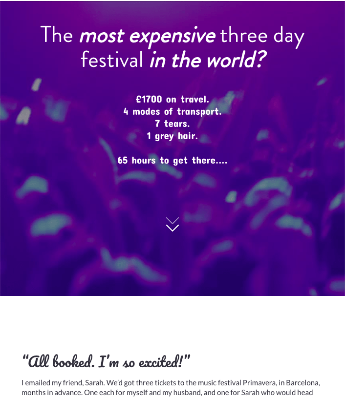
Check out this great example of interactive storytelling that uses scrolling to take you on a trip to Barcelona.
Processes and linear content: Working within the confines of set-screen real estate can make it tricky to walk through a complicated end-to-end process. Scrolling provides space and flexibility to present each stage in a more comprehensive way.
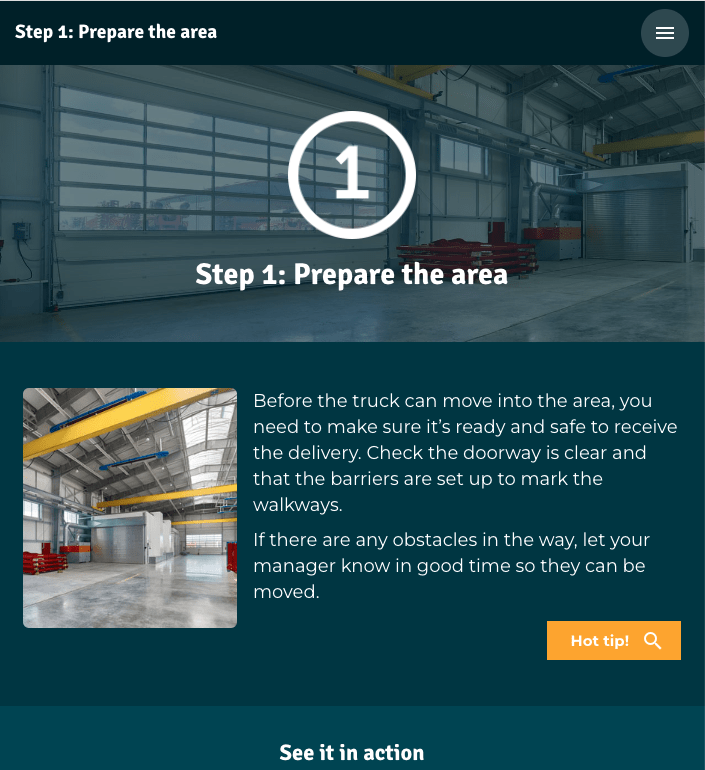
Here’s an example of delivery safety training that breaks up process steps into short scrolling pages.
Performance support content: Employees working in an industrial or retail setting often carry a laminated information sheet to refer to throughout their day. Available on a tablet or phone, an easily accessed scrolling page can provide a similar learning experience in the flow of work.
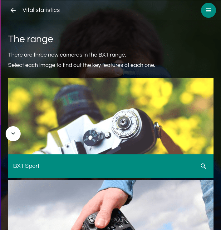
Take a look at this example of product knowledge training, which uses a scrolling page for the key facts and a paginated approach for its quiz and customer challenges.
Microlearning: Standalone scrolling pages are perfect for compact learning experiences. Removing the clicks needed to get the learner from the menu through multiple pages means people get straight to the learning they need.
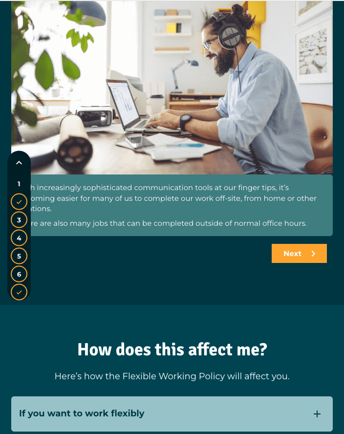
Check out this example of a microlearning one-pager on HR content.
3 top tips to create effective scrolling pages
So, you’ve decided that scrolling pages are the right approach for your project. Before you start designing your pages, here are our 3 top tips you should bear in mind.
- Start with a wireframe
With more space to play with, you need to plan out exactly how you’ll use it. What will the page look like? How long will it be? What interactions will you use? Where will text and visuals have the most impact? How will you group your content together and make sure it connects? By planning and wireframing your page in advance, you can make sure it has real impact.
- Bigger isn’t better
No one wants to scroll down a never-ending page on the hunt for a key piece of information. That’s why, at Elucidat, we have a rough guide of up to five or six sections as a maximum in any scrolling page. Whether it’s a break in a story or a decision point, look at your content and identify where best to move to the next page and not overload your learner.
- End with a call to action
As with all digital learning, you want people to continue their learning experience in the real world. Think about how you can wrap up the page with the key takeaways and what the learner needs to do next. This is particularly important with microlearning as it’s such a short learning experience.
Summary
Although it’s not the only way to do things, scrolling is a great approach to have in your learning design toolkit. Scrolling pages offer the space and flexibility to get creative with your content and visuals. Make sure you’ve planned exactly what goes where on your page. Keep it short and punchy so your people can access the learning they need, when they need it. End with a call to action so your learners know what to do next. With well-chosen and paced content, you can make sure your scrolling pages have a real-world impact.
Want to learn more about how to design effective elearning? Download our guide.
