7 tips for designing accessible elearning
5 minute read
Everyone should be able to have a great learning experience. This means making sure you consider accessibility when designing elearning. Online accessibility is the key to unlocking great learning for all.
There are some simple and practical changes you can make to your corporate elearning course design to meet (and exceed!) WCAG 2.1 and Section 508 guidelines. Here are 7 tips to help you create accessible elearning experiences.

What does accessible elearning mean, and why is it important?
Accessible elearning means that anyone, no matter their needs, can fully experience your learning. For instance, if a partially sighted person were to use your digital learning course, they should get as complete an experience, and gain knowledge equally efficiently, as a fully sighted person.
Making your corporate elearning accessible is essential. In fact, it’s law:
All parties “must consistently design, construct, develop, and maintain facilities, technology, programs, and services from the onset so that all people, including people with disabilities, can fully and independently use them.” Section 508 2017 (the UK equivalent is the Equality Act).
This doesn’t have to be a problem for you, the content creator; in fact, it should be something that is integrated into your development process. Here are a few simple guidelines to follow to make implementing learning accessibility easy:
7 practical tips for designing accessible elearning
1. Design with audio and visual in mind
There are several reasons why a learner may prefer an audio or visual version of your course. However, it’s important to make sure all your audio content is also available as text, either via a transcript or closed captions, to cater for all those who are deaf or hard of hearing.
If visuals are a must-have, make your content compatible with assistive technologies (e.g., screen readers). This can be done by:
- Adding closed captions
- Providing a transcript
- Choosing your language wisely
- Adding alternative (alt) text
Here’s a list of screen readers you can test for free:
2. Add subtitles to your videos
If you are including video or audio, ensure that you include an introduction before the video to introduce the content and tell the learner how to interact with it.
Always ensure that you include subtitles of the multimedia content. This can be done either via closed captions or by including a separate transcript field. This way, individuals with visual or hearing disabilities can have an equally as effective experience, ensuring online learning accessibility.
3. Add captions to images
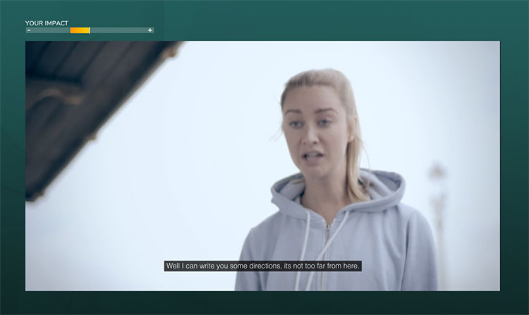
If key information is included in your images that you need all learners to understand, then add a caption to your images. Make sure you also include the text alternative, or “alt text,” to explain what the picture is displaying. Creating accessible digital learning imagery through captions is essential for the visually impaired.
This might not be required for all images e.g. if they are supporting graphics that are not essential for understanding your content.
4. Check your color contrast
Contrast is key to the readability of text. Ensure that contrast is high, either by using very different tones or very different colors. Consider boosting your text size too, to improve legibility.
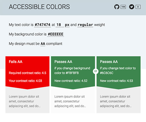
If you’re placing text on a background image, then use a colored tint to knock back the image so the text stands out as clearly as possible – try to avoid placing text over busy backgrounds! Effective color contrast will make any text far easier to read for individuals who are partially sighted or color blind.
5. Use similar hues
A well-designed graph or table with a range of distinct colors may look great, but it’s not heavily accessible.“When designing visual aids, using a variety of colors might seem like a good idea at first, but it can make it a lot harder for people with color blindness to interpret the data.” (Steve Schoger – Designer)
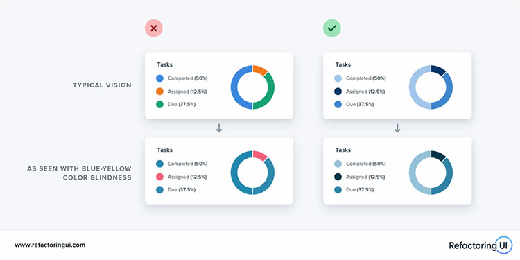
Instead, try using multiple shades of the same hue – it’s much more accessible and looks better, too!
6. Consider your interactions
Certain interaction types are not fully-accessible for all learners. For instance, some drag and drop and sortable activities rely on a learner using (and being adept with) a mouse, which will exclude anyone using keyboard navigation. Consider whether your corporate elearning content can be reworked slightly to allow an alternative, more accessible interaction.
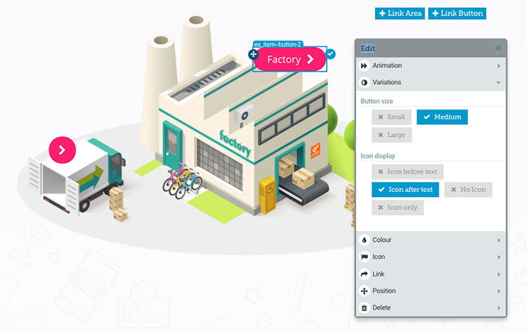
If using an image explorer, consider switching the hotspots from icons to text labels to ensure they are not reliant on the image alone and clear for all users.
7. Think about your choice of words
Words like “click” imply that learners are using a mouse. Links are summarized by screen readers, so ensure you make the sentence that is linked self-sufficient so it will make sense out of context.
For these reasons, consider using “Select this link to find out more about XXX” rather than “Click here.” We recommend that you read this great article on inclusive language.
You can find more best practice tips to designing accessible elearning here.
How to apply these tips to accessible training
When you incorporate the seven tips above into your elearning design, you’re not just meeting accessibility standards you’re creating more inclusive, accessible training for everyone. Start by checking elements like captions for videos, alt text for images, and ensuring text contrasts well with backgrounds. You should also test interactive features, ensuring they are keyboard-friendly and compatible with screen readers.
Use tools like WAVE, axe Accessibility Checker, and Google Lighthouse to run automated accessibility tests and catch common issues. Once you’ve identified problems, apply the necessary fixes. Regularly reviewing and testing your content ensures your elearning materials are accessible to all learners.
Summary
Designing accessible corporate elearning is a win-win. Not only will applying these simple design and development changes help you meet content accessibility guidelines, but it also ensures that you’re creating great learning experiences for everyone. This will naturally boost overall performance and understanding within your organization. As such, accessible digital learning is a necessity in the modern workplace.
Open up your elearning to anyone with Elucidat
Empower all your learners, no matter their circumstances or capabilities, to have access to impactful elearning experiences. Book a demo of Elucidat to explore how you can quickly and easily create accessible training.
Read on to learn more about Elucidat’s accessibility capabilities!

