Introduction
With 86% of training now taking place either completely or partly online, it’s clear that digital is a key element of every successful L&D strategy. Faced with widening skill gaps, most businesses are looking to digital learning to help them respond. But this increase in demand for online learning has seen 43% of L&D professionals struggling to respond at speed, while maintaining quality. And there’s no point delivering lots of training solutions quickly, if they’re not effective.
So, how do you design engaging elearning that meets end users’ needs and delivers real business impact?
We’ve surveyed learners, gained insight from L&D professionals and reviewed the latest industry research to discover what makes engaging elearning experiences that deliver impact. This guide brings together our findings and provides elearning best practices, practical tips and lots of examples.
So, whether you call yourself a learning designer or performance consultant, an accidental instructional designer or a subject-expert, you’ll find what you need to design effective online learning solutions.
What is elearning best practice?
The modern learner has around 20 minutes a week for learning at work (Bersin & Forbes). That’s a mere 1% of their working week. This might not even be 20 minutes in one go or one place. So, a really crucial aspect of what makes effective elearning is that it respects its audience and makes good use of this time. After all, elearning effectiveness is measured on whether it makes a difference to a person’s behavior or performance habits. It needs to drive change!
Effective elearning design takes into account modern learner trends and dives into the needs and habits of its end users. Long haul, click-through, interactive elearning? No thanks. Elearning effectiveness comes from solutions that are engaging, relevant and personalized.
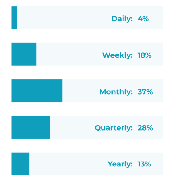
How frequently are employees engaging with elearning courses?
What do you know about modern learner needs?
When we talk about learning we’re really talking about changing people’s behaviors and habits. To be successful, you need to get under the skin of your audience.
What will really help them perform better?
What will engage them?
And what challenges and blockers do they face?

“Think about how you can advocate for your learners. Ask why this is useful? What’s the purpose we serve…I really think that we have an opportunity to influence in a broader way…and from a learner centric perspective.”
Stella Lee, Founder, Paradox Learning, Leading with purpose through thoughtful L&D
Of course, every organization is different. So, it’s vital you always research your end users as part of your elearning development process. To boost your own findings, however, we have pulled together key insights from our own research with modern learners – otherwise known as employees in global organizations.
Read on for the headlines.
3 key insights on the modern learning experience
How to design a successful elearning course
So, how do you take these learner insights and use them to deliver more successful people-centered training that tackles your business’ skill gaps? What does a good elearning course look like?
Here are 4 key principles for impactful digital learning
1. Make it relevant

Solutions that overtly meet the
specific performance needs of individuals
in their context

Taking a one-size-fits-all or a
“top down” approach
to learning
62% of learners said relevant content was the most important factor when it came to elearning. If something is really useful it gives people intrinsic motivation to use it.
Mundane, generic content is easily spotted by learners, and they are then likely to switch off. The average person gives learning content around 7 seconds to decide if a page is for them or not, and will leave if their needs aren’t met.

“Acquiring knowledge must have an element of purpose…You’re going to get the information that matters to you right now. Because you’re faced with a situation where having the knowledge becomes essential.”
Lila Warren, Global Head of Retail Academy, Pret a Manger
Harnessing curiosity to empower learners
How do you achieve this?
Start with clear learning objectives and user profiles:
It goes without saying that unless you know what problem you’re trying to fix, why it exists and what the audience needs, your elearning project is unlikely to be effective.
Speak to them:
It goes without saying that unless you know what problem you’re trying to fix, why it exists and what the audience needs, your elearning project is unlikely to be effective.
Include examples:
To make sure you design elearning that’s overtly relevant to your audience, provide context. Don’t just tell learners what to do, include real life examples of how these skills are applied in their day-to-day work. This might require different versions of content, or the use of personalization tools to help filter out what’s relevant to that audience member.
Provide role or skill specific content:
Try a simple “role filter” at the beginning of your learning content, and then use dynamic menus or branching to serve up the topics or pages that apply to that role. If you’re providing training on a specific skill, ask your learners what context they need to apply the skill. Armed with their answers, you can provide the specific examples or application exercises they need.
Localize your content:
Translation can really help engage global audiences, but localization can go further. This is where someone from that location helps edit the written and visual content to bring it in line with local “norms” and contexts.
“Some training modules do not relate to the ever-changing nature of my work.
I must learn things that don’t relate to my department, which is time-consuming and inefficient.”– Anonymous employee feedback
2. Get truly interactive

Content and experiences that connect with audiences and motivate them to do something

Online manuals, technical jargon, passive experiences, indirect communications, click-through content
20% of learners said they switched off when elearning lacked interactivity. But they’re clear that interactivity isn’t just about clicking on the screen. It’s about engaging them through active participation and connection using a variety of approaches, including visual and multimedia content.

“[Effective learning] drives action, opportunity to practice and creates a series. There’s a more-ish effect. So, I’ve had a little taste and I want a bit more. I can fall into the rabbit hole, or I can grab what I’ve got and move on.”
David Hepworth, Learning & Talent – Design and Technology Lead, Aviva
Embedding democratized learning creation at Aviva
How do you achieve this?
Create participation:
Active learning and practice are the building blocks of effective or “sticky” learning. Encourage action and participation inside and outside your elearning. Reflecting, trying, practising, being stretched, failing, discussing, comparing (in person or online via social polling) – this kind of interactivity engages by involvement.
Tell stories:
Great digital storytelling and immersive learning experiences connect hearts as well as heads. It creates emotional connection which is vital for effective learning to take place.
Make endings the beginning:
Embed links to relevant next steps to create a continuous learning experience. For example, discussion forums, further learning, practice tasks, and on-the-job guides.
“Digital learning keeps my attention when it stays active and keeps me focused on the task.”
– Anonymous employee feedback
3. Keep it concise

Uses people’s time wisely, makes learning no longer than it needs to be

A splatter gun of disconnected pieces; just “info” without any support
17% of learners reported improved learner engagement when elearning was concise, easy to understand, and well-organized. Bite-sized, digestible digital learning can fit around schedules, so it’s no wonder it’s popular with busy employees.
But effective elearning courses aren’t just short for the sake of it. For elearning best method, go for solutions that deliver real value and make good use of learners’ time – whether that’s in 2 minutes, 10 minutes or longer.

“Content does not become more useful simply by virtue of breaking it into smaller pieces. To create useful content, we would actually have to talk to the people we are creating it for.”
Nick Shackleton-Jones, CEO and Founder of Shackleton Consulting
Stop going through the motions and start delivering learning impact
How do you achieve this?
Less is always more:
Reading on screen is hard work, and there’s only so much detail someone can take in at a time. Say what you need to say in the shortest way possible.
Use a direct, active voice:
Use the “you” word and focus on what people need to do (e.g., “here are three things you can do in this situation,” not “when in this situation, employees should…” Imagine the audience is in the room and say what you want to say out loud, then write it.
Make it scannable:
Use clear headers, subheadings, emboldened sentences, bullets and more to help make the copy more scannable and digestible.
Get visual:
An image is worth a thousand words. From diagrams to photographs, the right visuals can increase your impact. They help communicate your key concepts quickly, engage your learners and can even get an emotional response.
Spaced repetition of practice:
Rather than asking learners to sit through a two hour-long course which they’ll likely forget in a few weeks’ time, break learning into short chunks that have purpose. This allows you to build up learner competence and confidence incrementally across a period of time through spaced repetition.
“For me, it is interactive rather than simply reading lots of text, as this won’t keep my attention.”
– Anonymous employee feedback
3. Ensure it’s easy to access

Content that’s easy to find and use when people want it, wherever they are

Content that’s hidden in long courses, behind complex menus or systems, with obscure names
22% of learners said learning engagement increased when it was easy to access at the point of need. The vast majority of workplace learners prefer learning on the job.
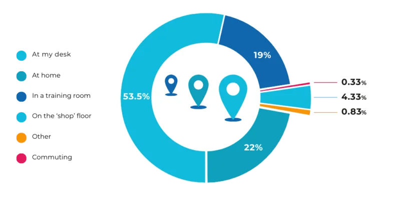
This means learning through doing, trying, observing and discussing. But it also means that any additional learning – e.g., answers to questions someone might have about a process or what tactics to use – should be easily accessible in those moments of need. Effective elearning is sympathetic to this, and doesn’t force lengthy, hard-to-use courses on people. Rather, it provides short form, responsive content.

“L&D is not responsible for learning. Learning happens in someone’s brain. Our job is to provide the best conditions …That doesn’t mean, we’re going to give you courses. It means that we’re going to understand what your problems are, and then provide you tools. And that may be a course, but it could be a simple checklist.”
Zsolt Olah, Senior Learning Technologist, Amazon
Rethinking learner engagement to deliver real impact
How do you achieve this?
Make it micro-learning:
Shorter chunks of elearning give busy users the option to use it in a moment of need, on their commute and on smaller screens. This article and video explains more about how to create effective microlearning.
Give choices:
Design your solution in a way that supports busy employees to make choices that are right for them. Do they need the 5 minute overview or the 15 minute deep dive? Do they want the activities they can do for themselves, or the case study exercise to do in a group?
Enable on-the-job learning:
Job aids, such as checklists, resources and how-to videos, are great for encouraging action, collaboration and discussion in the moment. Make sure they can be easily accessed on the systems people use as part of their day-to-day work, such as the intranet, Slack or Teams.
“For me, it is interactive rather than simply reading lots of text, as this won’t keep my attention.”
– Anonymous employee feedback
5 best practice approaches for elearning design to inspire you
Online learning materials can take many forms, from on-the-job performance support resources and diagnostic surveys through to microlearning skills training and immersive simulations.
Here are a few highlights from our best elearning examples to provide some immediate elearning inspiration.
1. Microlearning and on-the-job resources
There’s been a big shift from courses to resources in the last ten or so years. This microlearning approach can take various different shapes – from standalone job aids to multiple resources that are part of a cohesive learning journey or campaign. Here are two examples:
On-the-job resources
Access to microlearning resources which employees can use at the point of need has an immediate impact on performance.
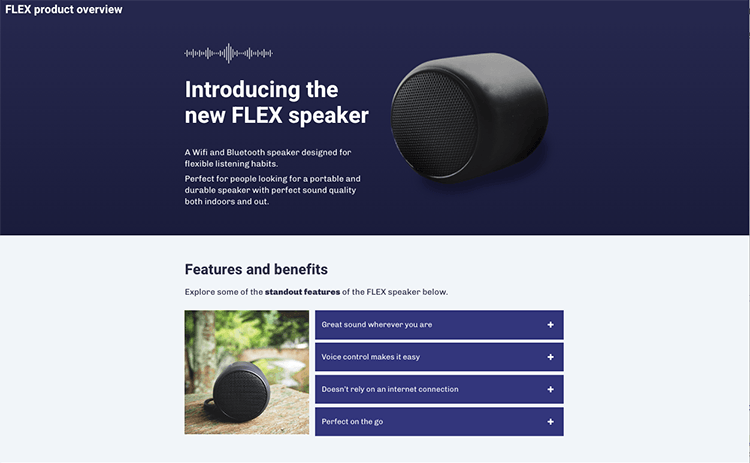
This product knowledge example supports people on the shop floor. It’s short and focused. Learners can use it as and when needed – to explore the product catalog or check a quick detail while with a customer.
Structured microlearning journeys
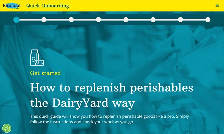
This quick guide example is designed to be part of an onboarding campaign for new starters. It uses an in-page progress menu to help learners orient themselves in the elearning course. The guide ends with real world actions to take on the shop floor during their first shift.
Microlearning design top tips
Be the answer to a specific problem:
Google is so popular because it helps you find just what you’re looking for. Microlearning needs to do the same. But your answer can be better, as it can reflect your workplace and audience context. Make each bite-sized piece specific, targeted and concise.
Create clusters:
Avoid producing microlearning nuggets blindly. Know how each topic fits into overarching performance goals and connects with other content. Is it a performance support resource, part of an incremental skill-building program, or both?
Create spaced practice:
Providing learners with regular challenges that enable them to practice applying skills in slightly new situations helps grow competence and memory more than other approaches. String together microlearning challenges/learning into learning journeys that get harder or easier depending on performance.
Keep track:
Consider allocating scores, badges, or some kind of reward to learners when they complete a challenge. Could the challenges be at different levels? Can you mark milestones for when X amount has been achieved?
Remember your learning design principles:
Just because you’re producing something short doesn’t mean it should be dry or just “info.” Stories, examples, demos, challenges, expert tips and job aides should all be considered.
2. Gamification
Game-like learning taps into a fundamental aspect of human behavior: motivation. Creating a sense of play and competition in your corporate elearning is great for engagement – and easy to achieve through gamification.
Gamified scenarios
Using levels, points and badges are classic devices to reward and motivate.
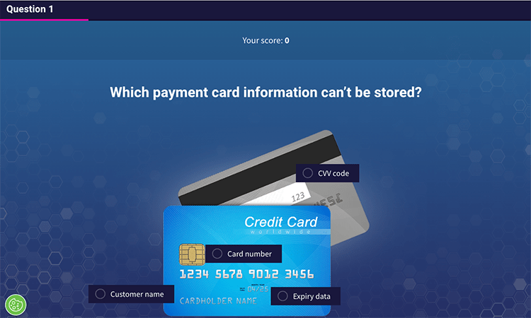
This game-like quiz example is made up of three rounds on data protection. Each round offers the chance to win points and badges. Learners are incentivized to apply their knowledge correctly, making the content more likely to stick in the learner’s mind when handling a real situation.
Gamification in elearning: design top tips
Start small, but don’t cut corners:
Rather than going all-in on a high-profile gamification project, target a particular business area, audience or program and experiment with different approaches. Don’t just add points to a task or tack a leaderboard onto an end-of-course quiz. The game mechanics have to serve a purpose beyond “making it fun.”
Prioritize the learning, not the game:
Points and competition only deliver value if they’re tied to behaviors and performance. Always get the learning objectives straight first and design game mechanics to be in service of those.
Develop a hierarchy of points:
Whereby points are easily earned (maybe for completing a profile or sharing the course) and accumulate quickly, but badges are more meaningful, offered only in return for doing something that demonstrates new knowledge, competence or skills.
Be clear on criteria and progression:
Keep people engaged and motivated. What tasks earn points? What do points mean? Perhaps they translate into badges or unlock new content. What’s the criteria for reaching the next level or reward?
Ramp up the challenge gradually:
Learners need frequent, easy achievements to begin with. Once they’ve gotten to grips with things and seen that effort reaps reward, they’re primed and ready for a bigger challenge.
Don’t disregard individual competition:
It isn’t always feasible or appropriate to pit learners against learners on public leaderboards – but that doesn’t mean you can’t successfully gamify your content. Social polling in elearning lets an individual see how they compare to others, but anonymously. Or, take FitBit: it has the community aspect, but plenty of people use it without that. Intrinsic rewards may count for more than social (extrinsic) achievements.
3. Interactive multimedia and content
Interactivity is all about driving engagement. Rather than simply reading text or watching a video, you need to get people reflecting on what they’ve seen or putting what they’ve learnt into practice. There isn’t one right way to deliver content. But by using a well-chosen and arranged combination of content and interactions you can produce learning with impact.
Digital storytelling
Storytelling is an incredibly powerful force for learning and memory. It has been part of what humans do since the beginning of time. When done right, it has the ability to strike up emotions and connect with users – which are both crucial to engaging their hearts as well as their minds.
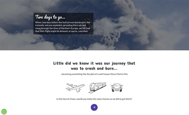
This storytelling for learning example shows how storytelling doesn’t always need audio or video to work. It’s a subtly interactive story that asks users to make some choices for themselves partway through. Great for the start of a wider performance change campaign.
Storytelling design top tips
Find the human side of your content:
Whether it’s the story of an overstretched parent whose relationship with his children improved when he made some changes to his day (time management training), or the trials of a young manager who felt overlooked and shut down by her superiors (diversity and inclusion training), people and their experiences will make your content compelling
Show, don’t tell:
When you’ve uncovered the emotion, let it take centerstage in your story, and trust your learners to work out what’s going on. Write dialogue rather than learning points, focus on feelings, and describe senses rather than stating facts.
Provide multiple perspectives:
Our natural curiosity doesn’t just apply to one character in a story. Often, we’re intrigued by how our opinion differs from our others.
Not sure why stories and learning are a winning combination?
Check out these ideas and top tips for success in storytelling in elearning and
this immersive storytelling article for inspiration.
Scenario-based video learning
Scenario based learning puts users in the driver’s seat and is a great way of increasing their engagement with a digital learning experience. “Choose your own adventure”-style scenarios like the examples below immerse users in a story and allow them to make decisions that control the outcome. This approach allows users to learn through experiencing consequences rather than being informed of them. In particular, it enables people to learn from (safely) making mistakes.
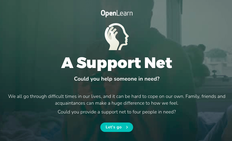
This video branching scenario, based around mental health issues, asks users to make a call on what they think is going on and what action someone should take. The personalized results at the end analyze the approach the user took, compares it with others’, and sets out how other options would have played out.
Video-based elearning design top tips
Don’t splash the cash unless you really need to:
Check if the perfect video already exists on YouTube or other platforms, and embed it.
Make it personal:
Capture personal stories when interviewing people, not corporate messaging. Do a few takes, each time helping your subject drill down to the essence of their story.
Experiment with selfie videos:
Taken simply on a smartphone, and have people upload them for you to use within or to complement your elearning.
Check out more advice in this micro guide to using
audio and video in elearning.
Reflective learning
Getting people to reflect on their current capabilities is critical to improving their performance. Afterall, you need to know what you want to improve before you can improve it.
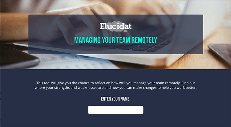
This guided self reflection encourages learners to stop, reflect and then commit to actions they’ll take forward to manage their team more effectively. Including social polling appeals to people’s natural curiosity as they can compare their own responses to those of their peers.
Reflective learning design top tips
Start with a chance to reflect:
Asking your learners to reflect on their current experiences is a great way to engage people at the beginning of your learning experience.
Add reflection points throughout:
Keep learners reflecting throughout the course. This might be rating an example, considering how they would apply a process or identifying what they want to do next.
Leverage FOMO:
Use social polling so learners can see how they compare to their peers. Fear of missing out on being part of the gang will help motivate people to change their behavior.
4. Accessible and inclusive content
Everyone should be able to have a great learning experience. With employees accessing elearning anytime, anywhere, and on any device, delivering quality responsive elearning on smaller screens is critical. And if you want to ensure your digital learning is truly inclusive, it means making sure you consider accessibility and responsive design from the start.
Mobile learning
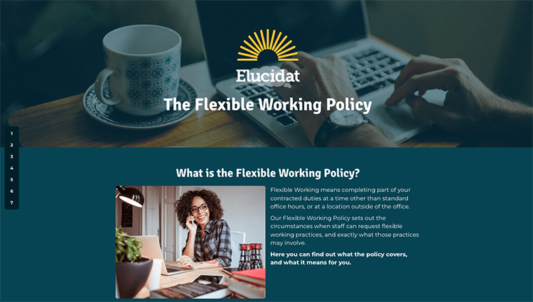
This quick briefing example shows how a short interactive resource could be used for just-in-time support. The simple structure (What, Why, How and What’s next) can be quickly scanned through on any device. So people can access the information they’re after in the moment of need.
Mobile learning design top tips
Embrace the scroll:
Design your user interface so it’s a natural fit with the device and mimics how people explore other online content. Long pages and fewer clicks are best.
Make it bite-sized:
Design for the amount of time your users are likely to stay on their phone. Our data, based on millions of learners, shows the average session time on mobiles is 10 minutes.
Reduce the number of clicks:
Focus on one action at a time, removing unnecessary screens or clicks.
Make it thumb-friendly:
Ensure content can be easily accessed with thumbs, and buttons and links are big enough and spaced out.
Make it easy to scan:
The fast-scroll is inevitable, so make sure your key points will stand out. Use clear headers, numbered points and icons to grab attention.
Declutter:
Remove any images or sections that won’t work on smaller screens or just clutter up the experience.
This article contains the low-down on mobile learning design best practices.
Accessible elearning design top tips
Think about assistive tech from the start:
Make your content compatible with assistive technologies (e.g., screen readers) by adding captions, providing a transcript and choosing your language wisely.
Think about readability:
Color contrast is key to readability of text. Ensure that contrast is high, either by using very different tones or very different colors. Consider boosting your text size too, to improve legibility.
Consider your interactions:
Certain interaction types are not fully-accessible for all learners. For instance, some drag and drop and sortable activities rely on a learner using (and being adept with) a mouse, which will exclude anyone using keyboard navigation.
5. Assessments, quizzes and questions
Assessments that test learners’ understanding are often critical, especially where compliance is concerned. But don’t just save these for the end of your course assessment. Start with a question to find out what they already know. Challenge their preconceptions. Get them to reflect on how they approach things. Use questions to pace the learning. Follow up after you’ve provided key content to check their knowledge.
Upfront diagnostics
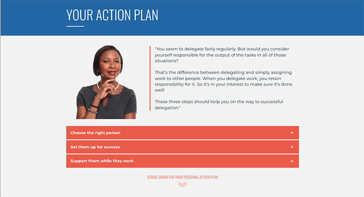
This personalized toolkit example asks targeted multiple-choice questions to users about their current habits and struggles when delegating work. It then serves up a tailored report based on how they answered to help them see where they need to improve. It makes effective use of learners’ time by honing in on real gaps and providing targeted guidance on the next things they need to do.
Of course, this sophisticated diagnostic isn’t the only way to help learners find content that’s relevant. Smart menus that include reflective questions and give clear choices allow people to tailor their learning experience.
Robust assessments with question pools
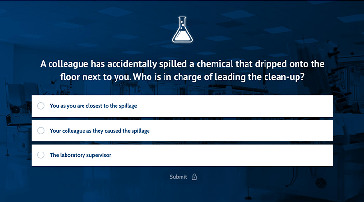
In this compliance test, question pools are used to create a robust assessment. Question pools mean that when a learner retakes the test, they’re unlikely to see the same questions again. This helps ensure learners truly understand the content – they won’t be able to simply choose a different answer on a second attempt.
It also makes it harder for learners to share answers as it is unlikely their colleagues will have been posed the same set of questions.
Assessment and quizzes design top tips
Write the questions before the content:
This may seem counter-intuitive, but by writing solid questions that test the learning objectives and then developing content to support those questions, your content will be leaner and tighter.
Test what you want people to do, not what you think they should know:
Always try and put the question into a workplace context. For example, give the learner a scenario and ask which of the answer options would resolve it, or ask, “Here are the opinions of four colleagues. Whose would you follow to resolve this situation?”.
Get people thinking with your incorrect options:
A good distractor should seem like a plausible option to someone who doesn’t know the learning content, but should be clearly wrong to someone who does. It shouldn’t, however, be incorrect on a vague technicality – especially if that technicality isn’t specifically covered in the course material.
5C framework for effective elearning
Although every organization and project is different, certain steps are fundamental to the success of all digital learning. We’ve drawn on the experience of hundreds of learning teams and boiled these down to five key stages.
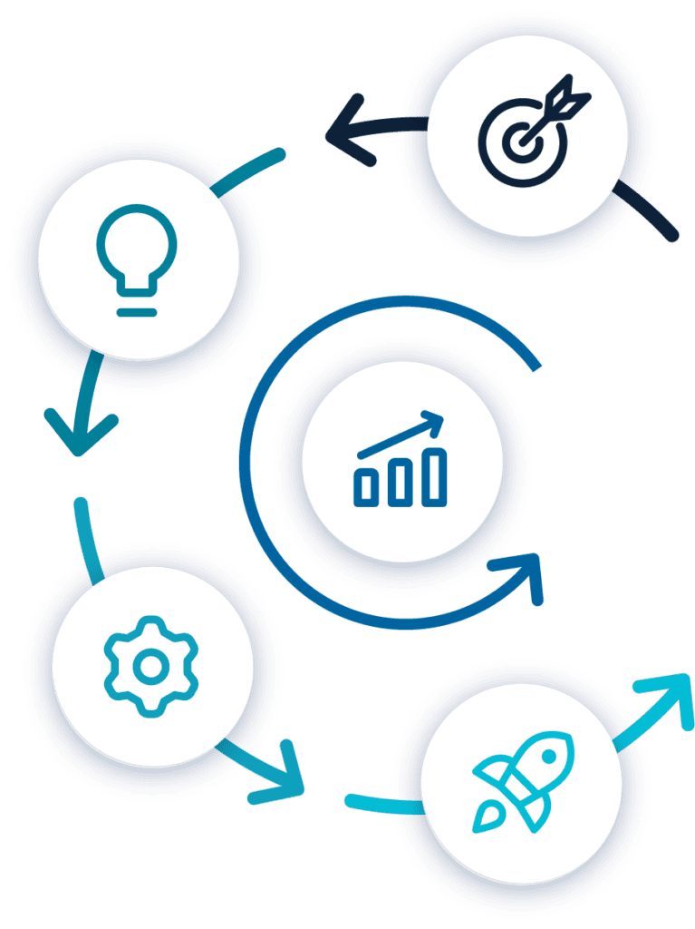
Capture – start with a clear plan:
Understand the problem, so you can shape your solution.
Conceptualize – lead with a prototype:
Turn what you know about your audience’s needs into a vision for effective and engaging learning.
Create – build with confidence:
Start building in your authoring platform with a streamlined, efficient development process.
Cultivate – improve and refine:
Use data to improve projects and inform future strategy.
Commercialize – deliver better ROI: Making sure your product works for your busin
Top tip: Embarking on a new process can be daunting. Start small by trying out the process on one project. Focus on the first three Cs (Conceptualize, Create, Cultivate). Decide on what works for you, your colleagues and organizations.
Find out more and access our free 5C Framework guide to walk you through each step of the process.
Collaborative ways of working
Of course, even the most robust process will fail if it’s not supported by effective ways of working.
Developing impactful training can’t be done alone. You and your team may be the experts when it comes to learning, but without the skills and knowledge from across your organization you can’t deliver.
There are two key players who can make or break your project:
Collaborating effectively with these colleagues speeds up production so you can meet training needs and respond to emerging skill gaps more quickly. And with everyone onboard with your best practice approach, you can even start to increase their involvement. Rather than just being your gateway to content and audience, SMEs can become elearning authors. With the right support and collaborative tool, they can input content directly into your authoring platform. Freeing up you and your L&D team to focus on strategic oversight, building quality and maintaining consistency.

“L&D is not responsible for learning. Learning happens in someone’s brain. Our job is to provide the best conditions …That doesn’t mean, we’re going to give you courses. It means that we’re going to understand what your problems are, and then provide you tools. And that may be a course, but it could be a simple checklist.”
Zsolt Olah, Senior Learning Technologist, Amazon
Rethinking learner engagement to deliver real impact
We’ve drawn on the experience of L&D teams who are taking this more collaborative approach to content creation. Their experiences have highlighted two key tools for effective collaboration during digital learning development.
Ready-to-go with templates
Don’t reinvent the wheel with every learning project. Using templates reduces the time you need to create courses with real impact.

“I could create templates, that aligned with the nCino brand and what our other courses look like, but also that incorporated instructional design best practices”
Olivia Cunningham, Instructional Designer, nCino
Customer spotlight: Guided Authoring
Start by building up a good selection of templates with specific training purposes in mind. Make sure they’re on brand, ready-styled, and have a sensible flow to them.
Once you and your colleagues – the L&D experts – are happy with the templates you’ve created you can open them up to be used by your SMEs. They’re experts in their own area and not learning designers, but with ready-to-go templates they can produce the building blocks of quality elearning straight away.
Help SMEs stay on track with your templates by:
Curating best practice examples:
Bring together some great examples of the learning your organization produces. Suggest templates to SMEs so they can get off to a great start with the most appropriate template for their learning.
Providing baked in guidance:
A template, even with on-brand styling and a structure, is still an empty shell. Go further and include advice and guidance in your template, so SMEs use your templates correctly to include case studies, stories, videos, questions and much more.
Making asking for help as easy as possible:
In their normal day job, an in-house expert will turn to a colleague for advice or input when needed. Encourage this in their elearning creation too and help them get their project done more efficiently.
Top tip: If you’ve got a great design, why not reuse it? Whether it’s localizing existing learning or reworking an effective design, duplicating courses means you don’t have to start from scratch and maximizes the impact of your effort.
Want to find out more ways to support your SMEs?
Check out our guide to setting SMEs up for success.
Clear review stages
The key to ensuring you’re creating impactful elearning is to set and hold up standards. Getting the right people’s input and review at the right points in the process will help you do this.
Clear review stages:
Make sure each project has clearly identified review stages and reviewers. This will help you ensure projects are on track. When and how often this takes place may vary depending on the size/risk of the project. Flex your approach but make sure it’s defined on each project.
Ensure you have oversight:
If SMEs are using your ready-to-go templates, L&D should support and have full oversight. Make sure you are available for regular check-ins and final review points.
Keep the review process in one place:
Authoring tools, like Elucidat, make the whole review process simple for everyone involved. Seamlessly invite and manage reviewers inside your authoring platform, in a streamlined and efficient way. No more feedback hidden in long email chains or huge spreadsheets!
With 60% of employees rating their elearning fair to poor,
it’s time to give them learning experiences to talk about.
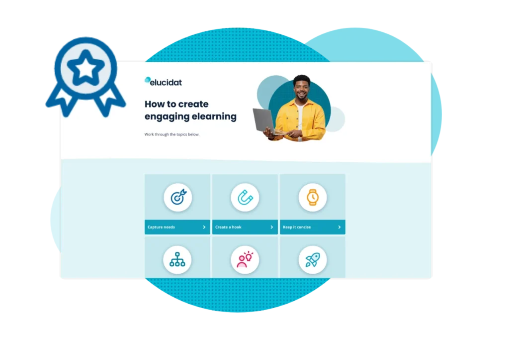
This interactive elearning course is designed to transform your elearning design in just six steps.
Summary
Effective elearning is about more than slick presentation. It’s about behavior change. It motivates and instructs learners on how to make changes that will improve their performance in the workplace. With that in mind, the best methods for designing great elearning all come down to your learner and their behaviors too.
1. Find out what your learners need
All elearning – in fact, all training – should be aiming to improve performance or solve a problem within the business. It goes without saying that unless you know what problem you’re trying to fix, you’re unlikely to be able to fix it. So, every elearning project should start with understanding your audience, their learning styles and training goals.
2. Put our best practice principles in action
- Make it relevant and useful by providing context and examples.
- Get truly interactive using storytelling, reflective questions and practical activities.
- Keep it concise by writing short, active content and developing microlearning as part of wider blended learning journeys.
- Ensure digital learning is easy to access by developing responsive and inclusive content.
3. Get set up for success with the right processes
Our tried and tested 5C framework will help you to plan, design, create, optimize and commercialize your elearning programs. Effective collaboration using templates and review tools speeds up the process and allows you and your L&D team to focus on quality and consistency.
Discover more ways you can create impactful elearning courses here, and see how to implement a successful training design process.
You can allow access this ‘How to create engaging elearning’ course to earn a certification in elearning design.
We can help you do it!
Elucidat is the collaborative tool your team needs to produce learning that excites and engages your audience. Guided workflows and ready made, expert designed templates make it easy for anyone to produce high quality digital learning at speed.
Enhanced collaboration features makes the review process seamless and maintains standards. Empowering you and your colleagues in the L&D team to expand content production and capture expertise, all while increasing learning quality!


