Top 10 fool-proof elearning design tips every designer should follow
6 minute read
If you’re in need of some design tips to drive the impact of your elearning, you’re now covered. We have summarized some of our most noteworthy elearning design tips, so that you can tackle your projects armed with the right strategy. Follow these 10 must-do tips to ensure your elearning always packs a punch.

You might have already explored our practical advice on elearning design, via Design Tip Tuesdays. Missed out, or don’t want to trawl through old emails? Don’t worry – we have summarized some of our tips for effective elearning, so that you can go into 2023 armed with the essentials to kick start your organization’s digital learning designs. You’re welcome!
10 elearning design tips every designer should follow
1. Share ‘What’s in it for me?’ upfront
In today’s information-dense work environments, your learners might not feel that they have the time or headspace to really engage with all the training they’re enrolled in. So, it’s up to you to convince them they should.
Speak directly to your audience and be explicit about how this online learning will help them. What problem will it solve and how?
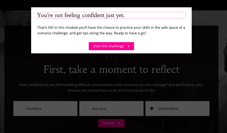
In the example below, you can see how this can be achieved with a simple, upfront question.
2. Talk to your learners naturally
You don’t want your organization to sound like a faceless institution, addressing an audience of machines. Instead, be a human: talk to learners naturally and be direct by addressing them as ‘you’, to help keep your learners engaged.
Furthermore, to motivate learners to go and do something as a result of your elearning, put actions in the future tense, not the past tense, to help meet learning objectives.
And finally, avoid technical, policy-heavy language that’s going to be overlooked, misinterpreted, or read like a lackluster legal document.
Look at the type of sentences used in the example below, which are short, conversational and action-focused.
3. Avoid creating an information dump!
If you overwhelm learners with information, the important messages will get lost, and they’ll actually remember less. Instead, focus on what you really want learners to take away and build your elearning around that.
So, ask yourself: Have you omitted any unnecessary words or descriptions from your copy? Can you swap out lengthy prose for a bullet-point list? Can you use headings and subheadings to chunk up information into smaller, more digestible parts? And do you really need to include all the detail, or can you point learners to some external materials, if they’d like to find out more?
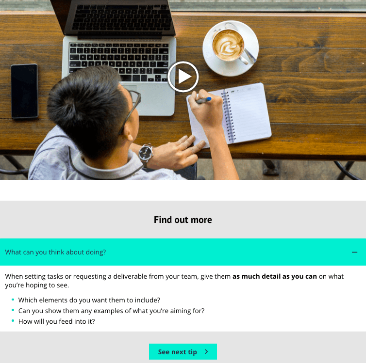
Take a look at the approach used in this module example, where you can see clear and concise messaging throughout.
4. Tell stories
Stories are everywhere. And there’s a reason for that – they’re powerful. A story brings information to life. It shows (not tells) learners the impact the subject has in the real world and helps them connect with it.
The most effective stories tap into people’s emotions, and they do that by having humans in their hearts. So, think about how your subject impacts real people. Use this to create a character to put at the center of your story.
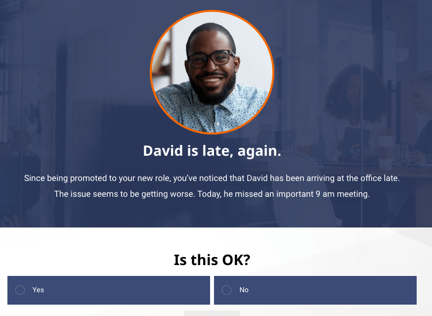
Here’s a great example of elearning that focuses on a strong fictional character.
5. Don’t forget the ‘why’
Ask yourself: What do you want learners to take from the learning? What will help them get there? All your decisions should be made with this end goal in mind.
If a piece of content won’t help achieve the objectives, don’t include it.
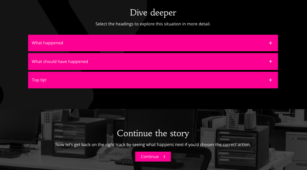
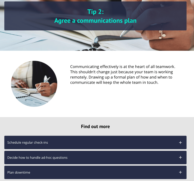
In this example, the module begins by outlining a problem, before providing the action-points for how to solve it, in the form of ‘tips’ for the learner.
6. Ask questions as you go
We are all familiar with end-of-module assessments but remember that you can also ask your learners questions as they go.
Questions and activities are the difference between a presentation and an immersive learning experience. Make sure you get learners’ brains working and test the things you really want them to know.
You can use midpoint questions and activities to check understanding or even to introduce new concepts in an interactive way.
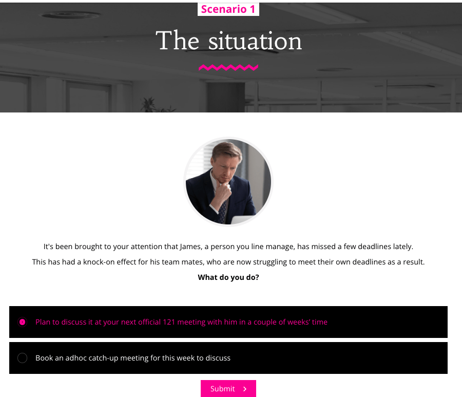
In this example, you can see that the learning messages are shaped around a scenario that’s weaved throughout the module. The learners are asked questions at different stages to encourage them to think about what they would do, then the question feedback is used to deliver the facts.
7. Choose your media for the story you’re telling
If you’ve ever been absorbed by a good novel, you’ll know that sometimes text alone is enough for a story to make an impression. But elearning gives opportunities to go further if you want to.
Talking heads videos, animations, scripted drama, interactive video, music, and sound effects all have a place in today’s media-rich learning environment.
But you don’t need a Hollywood budget or fancy computer effects to create impact. Have a look at this interactive story-based elearning to see how it immerses learners in a world by making use of free audio sound clips.

8. Make your assessment a great experience
We know that even the word ‘assessment’ can be off-putting. No one wants to feel like they’re back in a school exam hall. But if you design and write your end-of-module questions carefully, an assessment can actually enhance, rather than compromise, the overall learning experience.
Rather than simply testing learners’ memories, get learners to show they know how to apply their knowledge.
For example, placing them in realistic scenarios immediately gets them thinking about what they would do if faced with a similar situation. You can take this to the next level by telling a story, and weaving the questions into one overarching scenario.
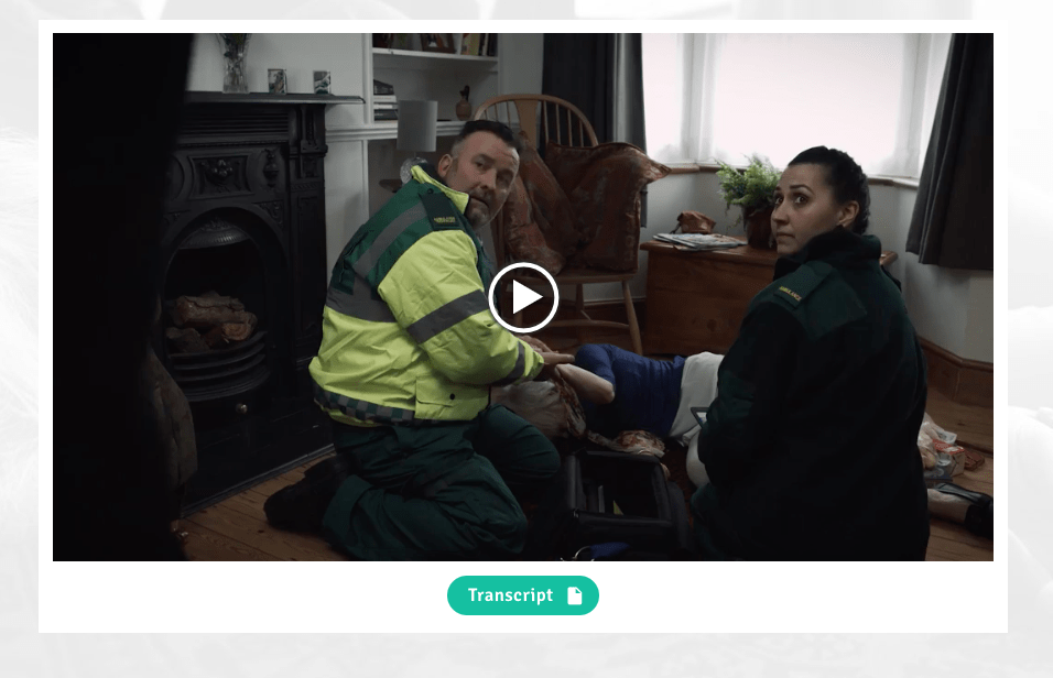
This hard-hitting scenario on critical medical care really shows the impact of asking learners to deal with a situation.
9. Recap your key learning points
Research has shown that beginnings and endings matter. What people see last often forms their lasting impression of their experience. It’s your chance to give them something memorable.
Make your elearning count by giving a clear recap. Think about which bits of information are absolutely key. Distill this down into a few short points and summarize at the end. This makes sure that the most important elements are easy to remember. Make them about action too!
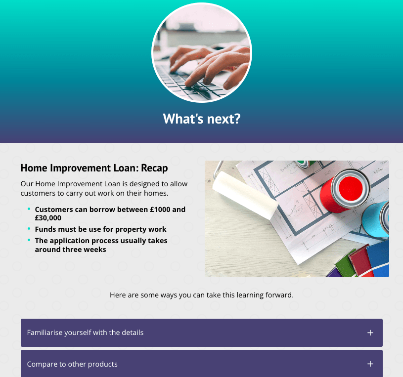
In this example, you can see the key takeaways spelled out in simple bullet points, plus some helpful next steps.
10. Top and tail the experience
Great elearning has the power to change behaviors and encourage new ways of looking at a subject.
It’s all well and good to say that, but how do you prove it to the business and the learners? One way is by using Elucidat’s Social Polling feature.
With social polling, at the start of a module, learners are asked to give their opinion on a matter based on a small amount of information. After working through the module in detail, they will answer the same question again. You can then playback their responses to demonstrate how the elearning has challenged opinions.
In this interactive module about behavioral change with social learning, social polling graphs top and tail the experience to encourage deeper reflection.

There you have it – a rundown of your elearning design essentials to make your elearning more impactful.
Looking for more elearning design tips?
Join Will Brown and the Elucidat learning consultancy team for their next Design Tip Webinar to inspire your elearning designs. From microlearning, to game-like learning to branching scenarios, every elearning topic is covered.
Check out the upcoming sessions and catch up on the previous sessions.
Keen to improve your process and create engaging elearning like this? Check out this training design process to get started.


